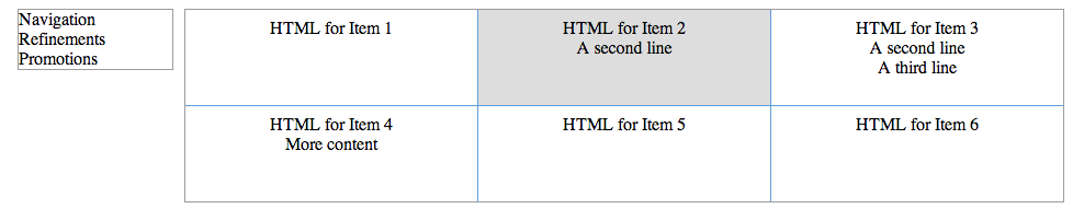
I was working on a responsive website design layout and we were running into issues that for the category pages, the products weren’t aligning just right. The page is 3 columns wide using li elements for each item.
The problem we were having is that some of the items have color swatches, and others don’t, some of the titles are longer than others and wrap to a second line, etc. I guess the easy way to say it is that there is dynamic content. So the height varies page to page.
Contents
The Solution
HTML
1 2 3 4 5 6 7 8 9 10 | <div class="product-grid-parent"> <ul class="product-grid"> <li class="item">... HTML for Item 1...</li> <li class="item">... HTML for Item 2...</li> <li class="item">... HTML for Item 3...</li> <li class="item">... HTML for Item 4...</li> <li class="item">... HTML for Item 5...</li> <li class="item">... HTML for Item 6...</li> </ul> </div> |
CSS
1 2 3 4 5 6 7 8 9 10 11 12 13 14 15 16 17 18 19 20 21 22 23 24 25 26 27 28 | .product-grid-parent { width:800px; } .product-grid { display: inline-block; list-style: none; width: 100%; padding:0; margin: 0px; text-align: center; } .product-grid .item { display: inline-block; list-style: none; width: 31.3%; margin-right: 2%; vertical-align: top; } .product-grid .item:nth-child(3n+3) { margin-right: 0; } @media (max-width:950px) { div.product-grid-parent { width:97%; } } |
- I found that the IE requires the vertical-align while other browsers naturally aligned the contents to the top. Note though that vertical align needs to be on an inline object, thus why we are using display:inline-block;
- You may need to adjust the widths and media queries for your site.
- Note the usage of nth-child(3n+3). That says choose the 3rd object and every third after that. If you were going to change this to a 4 column layout, this would be changed to (4n+4), or two column would be (2n+2), etc. Using these rules and your media queries you can modify the number of columns depending on the screen size.
- Keep in mind that the nth-child selector is part of CSS3 and thus will not work in IE8 and earlier.
- Note that as you scale the page down in size there may be some wrapping of your elements. The issue here is that we are using a px measurement for the border and a percentage measurement for the width. So as you scale down, a conflict occurs that the border width is causing you to go over 100%. Sadly borders don’t accept a percentage as a width. So the solution is to check for where these conflicts happen and use additional media queries to adjust your percentage widths. If you are using a background unique to each item, this becomes more problem-some as you need to be more accurate in the added widths of the media queries. If not, you can be less accurate as the user won’t notice that you’re a .5% off technically.
Live Example – Mockup
I put together a quick example of what this will look like.
Live Example – Active Website
This is the site that I did this setup on. The site is fully responsive and will go down to two columns for tablets and one column for phones, based on various width based media query break points.
http://www.luggagepros.com/supercat_Luggage/cat_Hardside–Luggage/index.shtml
Adding a Border
Many people want to add a border to add separation to the products on their category pages. The method mentioned above won’t work exactly right for this though, as the borders don’t carry through from top to bottom.
This solution will ensure the border fits top to bottom, however there is one slight catch to this – you’ll need to set a height on each of the items in your column to the maximum height that it will ever be displayed. While this is fine for the single row where the really tall element is, say 5 lines tall, the next row that has elements that are only 2 lines tall will still have the height of the 5 lines. So this application is not perfect for all situations. But depending on your content this might do the trick for you.
The HTML is the same as above, so please reference that. The CSS is slightly different however:
1 2 3 4 5 6 7 8 9 10 11 12 13 14 15 16 17 18 19 20 21 22 23 24 25 26 27 28 29 30 31 32 33 34 35 36 37 38 39 | .product-grid-parent { width:800px; } .product-grid { display: inline-block; list-style: none; width: 100%; padding:0; margin: 0px; text-align: center; border:1px solid #9C9C9C; } .product-grid .item { float: left; list-style: none; width: 29.25%; margin: 0; padding: 1% 2% 3%; height: 55px; vertical-align: top; border-width: 0 1px 0 0; border-style: solid; border-color: #5E9ED8; } .product-grid .item:nth-child(1n+4) { border-top-width: 1px; } .product-grid .item:nth-child(3n+3) { margin-right: 0; border-right: 0; } @media (max-width:950px) { div.product-grid-parent { width:97%; } .product-grid .item { width:29%; } } |
- Here we use floats rather than display:inline-block; for your .item elements
- Note that there is a height set to the .item elements as well. As described above, this is set to the max height that your .item elements will ever be.
Live Example – Mockup
I haven’t done full browser testing on this yet, but I’m fairly certain this should carry through to all browsers.
Live Example – Active Website
I used essentially this same technique on this website to mock up the table using a <div> structure.
http://www.luggagepros.com/travel/baggage-fees.shtml
Still not solving your problem?
The last option that I won’t go into here as it’s out of scope to the topic of this article is to use jQuery or Javascript to set the height. The logic would be that it needs to read all of the items in a row, find the tallest item, then adjust the height for all of the items in that row, and move on to the next row. In all honesty, this is the most reliable method in my mind as you wait for all of the content to load and then essentially go and hand set the heights for each item. However, despite liking jQuery, I try to use it only when necessary. If I can solve a problem with CSS (without jeopardizing SEO) then I’ll do that before I go into jQuery. It just makes more sense as CSS is loaded in real time where jQuery has to wait till after the page loads, there can be compatibility issues with some devices/users/browsers, and sites are getting too dependent on Javascript/jQuery and it’s just not needed at times.
While I’m not going to provide the full method of this in this post, I did implement this solution on this site, so if you feel like digging through the source code you should be able to find it easy enough.
http://advice.annsbridalbargains.com/
I hope these solutions help you out in your programming. I’m always looking for better ways to solve this issue. Let me know if you have any other options in the comments below.