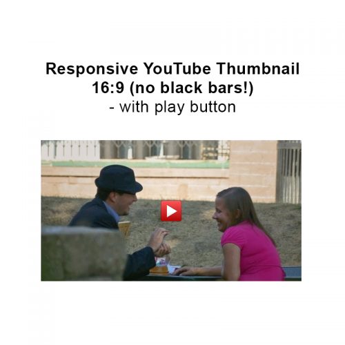
If you’ve ever use YouTube thumbnail images you’ve likely been as frustrated as me that they tend to come with black bars at the top and bottom of it. Given my video producer background and the history of YouTube I understand why they are there, but they are frustrating. You can learn more about the image sizes and formats in this post: YouTube Image Thumbnail URLs.
So when you want to use these images in a webpage and crop off of the black bars at the top on bottom, and ensure that the image scales correctly in a responsive design website, it can be a bit tricky. There’s a lot to consider here. Not to mention that you’ll typically want to add a play button over the top of it as well and ensure that it’s always centered regardless of the window size.
While it’s possible to write CSS that works in a responsive layout, it’s not widely accessible through a Google search. But I’ve come up with a solution, and thus wanted to share so it’s easy for me (or you) to find once again.
Live Example
I’ve put a working example here on a JSFiddle:
JSFiddle – Responsive YouTube Thumbnail Image 16:9
HTML
1 2 3 4 5 6 7 8 9 10 11 12 | <div class="ytImgContainer"> <a href="https://www.youtube.com/watch?v=yZuWQTXZBHI&width=640&height=480"> <div class="ytImgWrapper"> <div class="ytImgThumbBox"> <img src="http://img.youtube.com/vi/yZuWQTXZBHI/sddefault.jpg" class="ytImgThumbImg" alt="text"> <div class="ytImgThumbPlay"> <img src="http://promincproductions.com/blog/wp-content/uploads/2016/07/video_play.png" class="ytImgThumbPlayButton"> </div> </div> </div> </a> </div> |
Responsive CSS
1 2 3 4 5 6 7 8 9 10 11 12 13 14 15 16 17 18 19 20 21 22 23 24 25 26 27 28 29 30 31 32 33 34 35 36 37 38 39 40 41 42 | .ytImgContainer img { max-width: 100%; height: auto; } .ytImgContainer { margin: 0 auto; max-width: 604px; width: 100%; } .ytImgContainer:after { clear: both; } .ytImgContainer:before, .ytImgContainer:after { content: ""; display: table; } div.ytImgThumbBox{ position: relative !important; width: 100% !important; height: 100% !important; overflow: hidden; } div.ytImgThumbPlay{ position: absolute !important; top: 50% !important; left: 50% !important; width:48px !important; height:48px !important; margin: -24px 0 0 -24px !important; } img.ytImgThumbImg{ width: 100% !important; height: 100% !important; margin: -9.5% 0px -12%; } |
I hope this helps!

